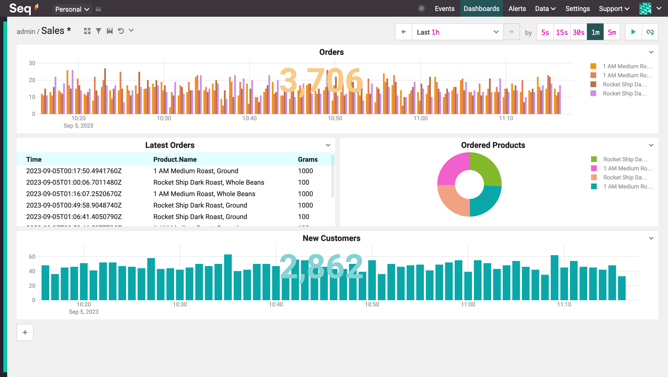
Dashboarding
Once you've started collecting structured event data, you'll be amazed how much interesting and useful information you can find in it. Dashboards are great for keeping track of important indicators of application and business behavior.
Sharing Dashboards
Dashboards are "personal" by default; to make a dashboard visible to other members of your team, use the drop-down menu beside the dashboard name, select "shared", and save the dashboard.
The Add to Dashboard Button
The quickest way to add a chart to a dashboard is directly from the events screen.
Count Events Matching a Filter
When viewing a subset of events, say, those matching a set of signals or a filter expression, a simple count of event occurrences can be created using the Add to Dashboard button:
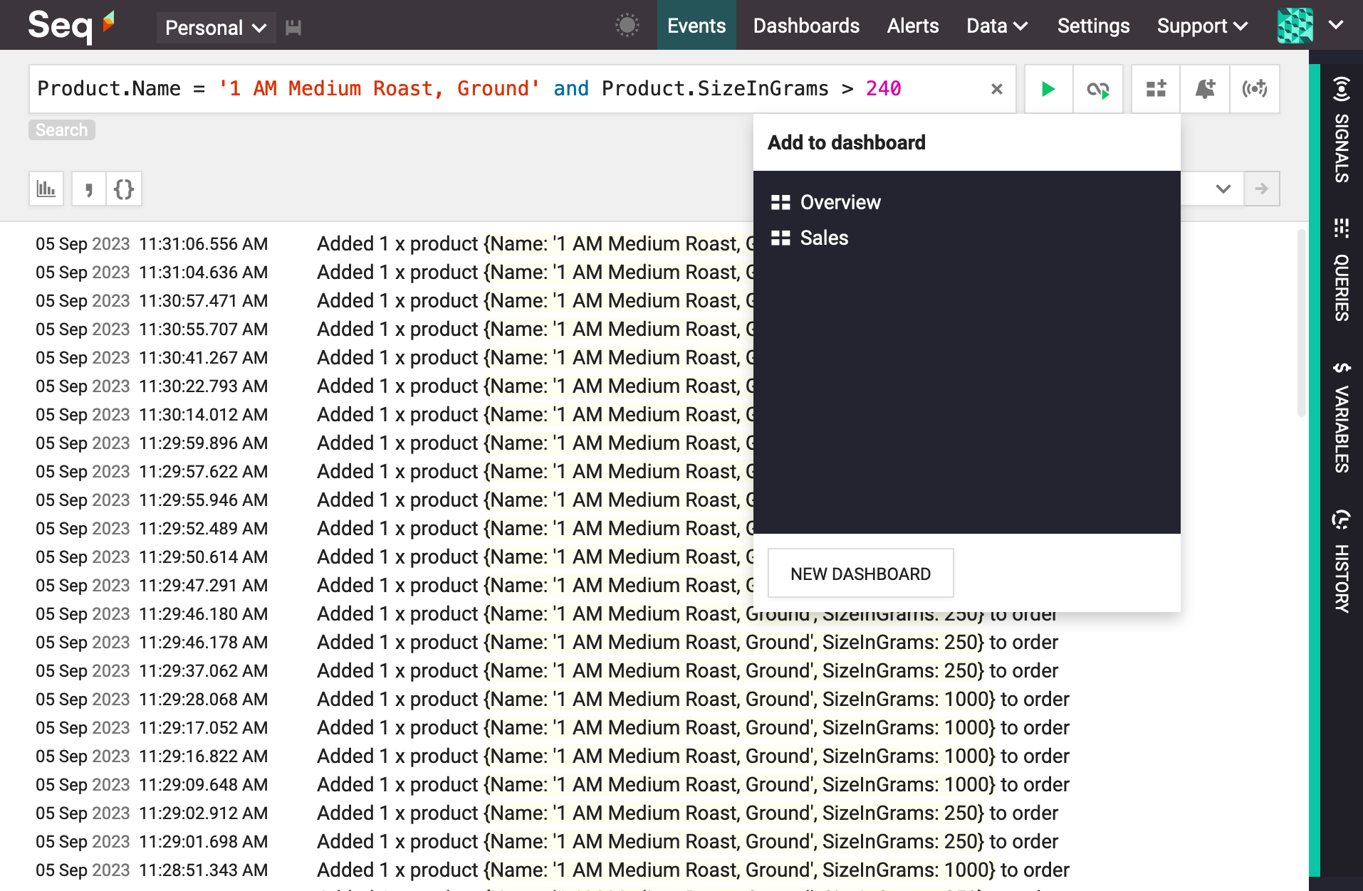
After selecting one of the existing dashboards, or New Dashboard to create a new one, enter a name for the chart and press Ok.
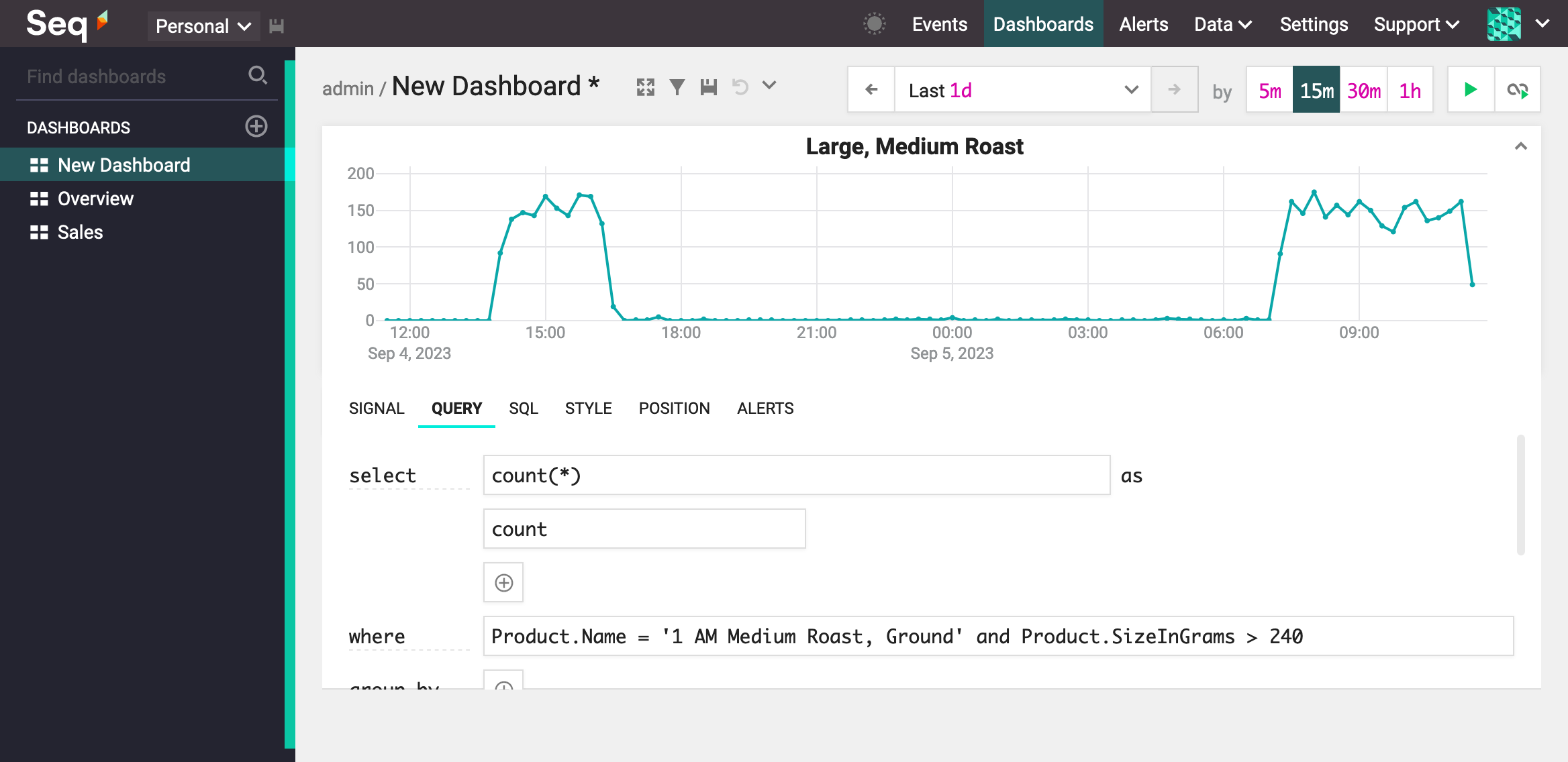
Notice that the dashboard itself needs to be saved: pressing the Save button in the top left of the grey dashboard area will do this.
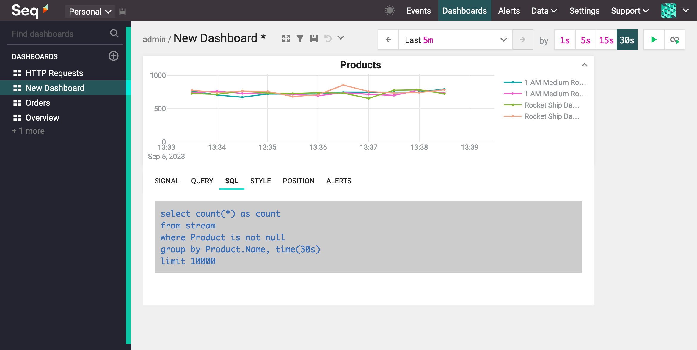
Add a SQL Query to the Dashboard
The Add to Dashboard button can also be used when viewing an SQL query to add that query onto the dashboard:
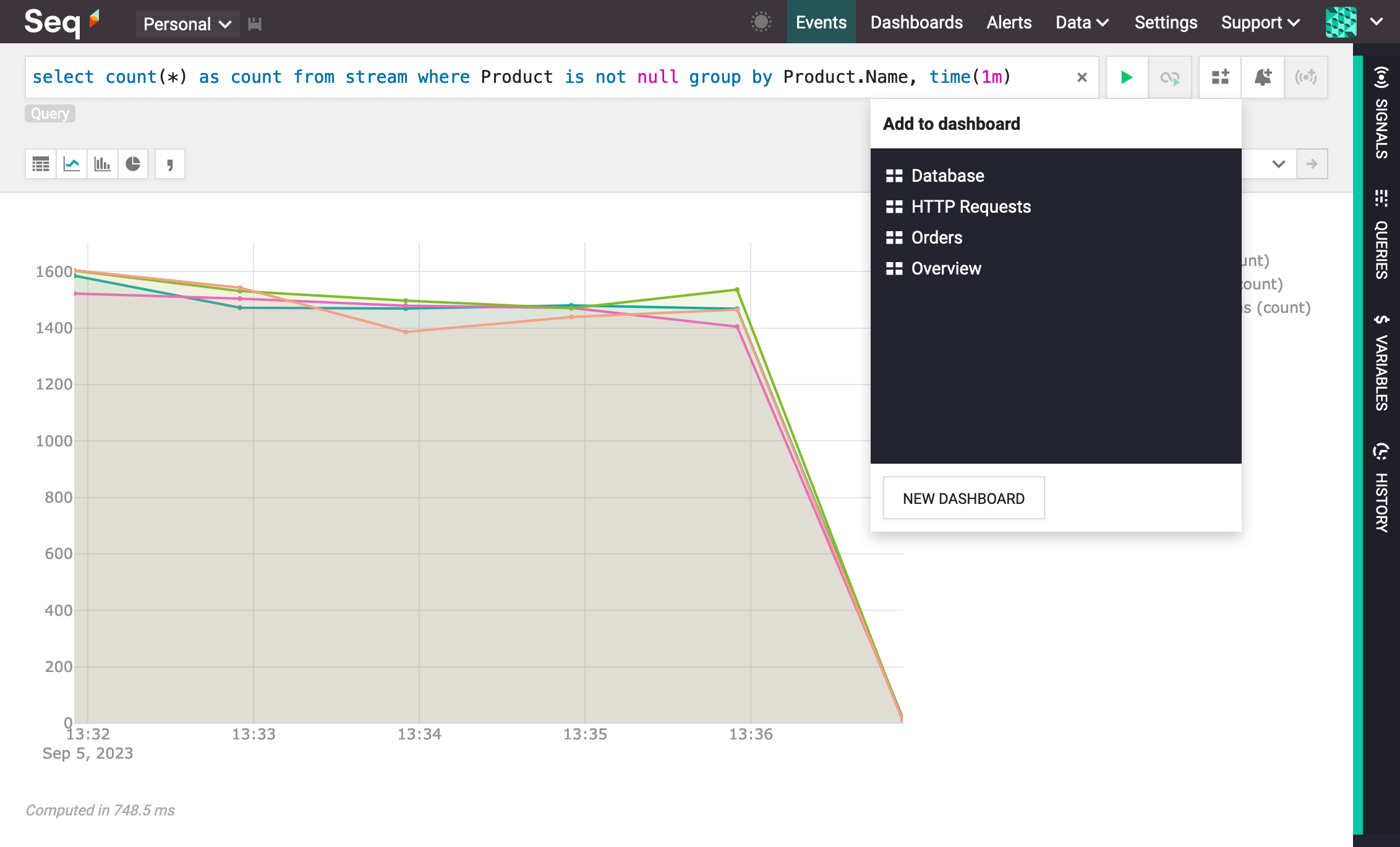
If the query is not already grouped by time(), Seq will transform the query so that the dashboard slices results into individual time intervals.
Creating and Editing Charts
Charts can present data in a variety of styles. This section explains each of the tabs shown when a chart is added via the events screen, with the + button on a dashboard, or by clicking the down-arrow in the top right-hand corner of the chart title.
The Signal Tab
To narrow down the events that will contribute to the chart, select one or more signals from the Signal tab:
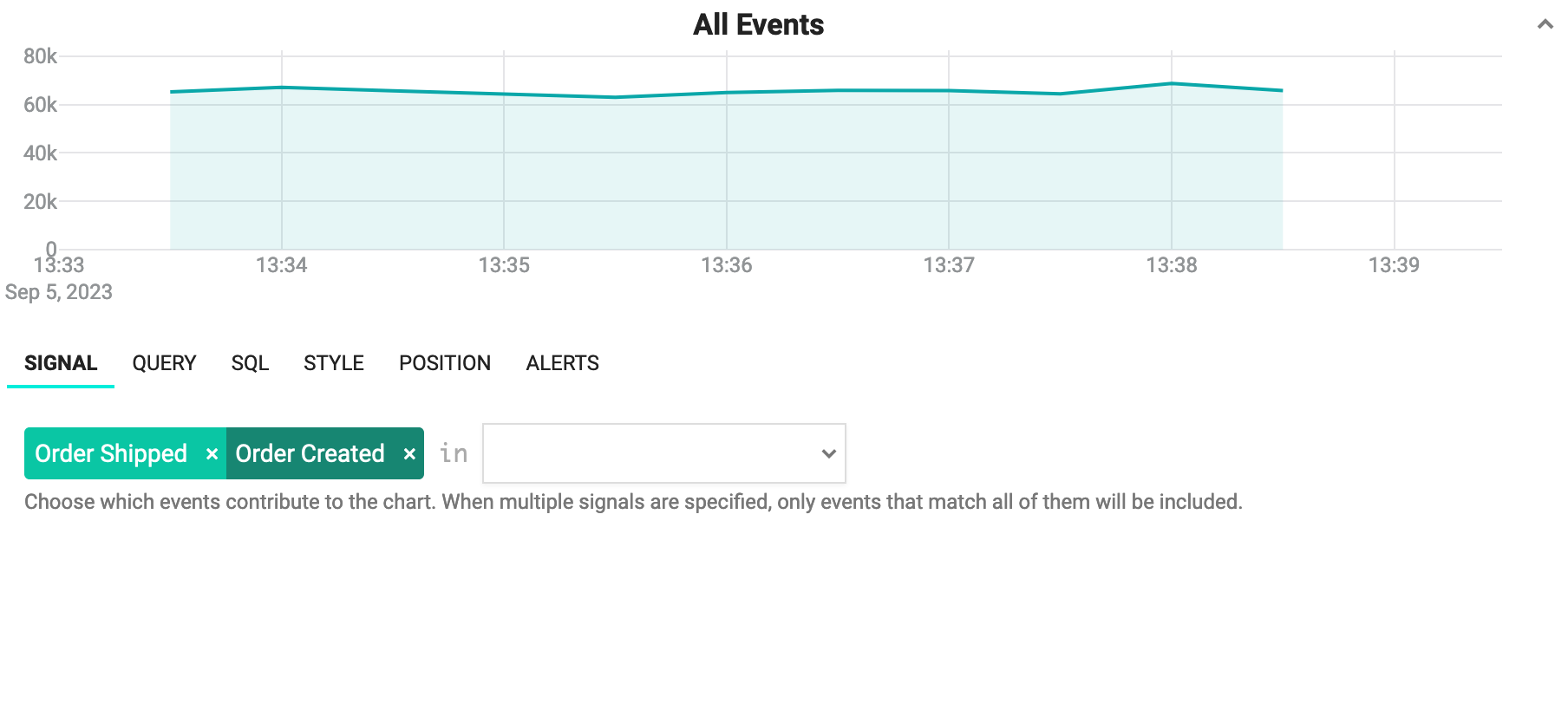
To remove a signal, click the x beside the signal name.
The Query Tab
The Query tab is used to choose one or more measurements to present on the chart.
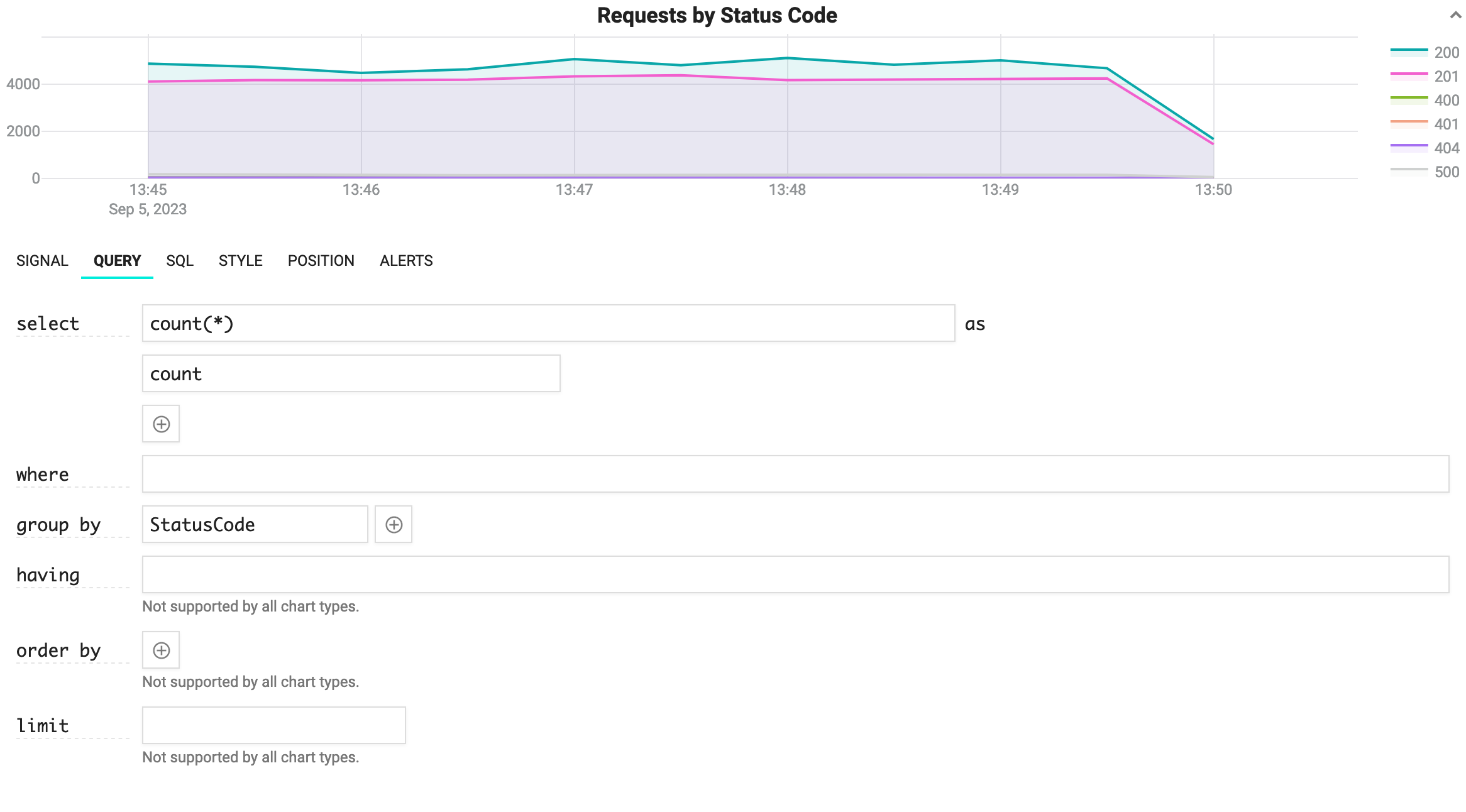
- select - Use this section to specify the measurements that are shown on the chart. The first input box accepts an aggregation expression like
count,sum,meanandpercentile, while the second box sets the label that will identify the series when more than one line is shown. Press+to add multiple measurements; delete the text in the first input box to remove a measurement. - where - This input accepts an SQL predicate to further restrict which data contributes to the chart. Strict SQL syntax is required (single-quoted strings, SQL-style operators).
- group by - Multiple series can be displayed for a single measurement by grouping the data, e.g. using a property name like
EnvironmentorMachineName. Use+to add more than one grouping, and clear the text from a grouping in order to remove it. - having - This input is similar to where, but applies its predicate over a grouping. This field is only relevant to rowset-based charts like pies and tables.
- order by - Specify an ordering for the data. This field is only relevant to rowset-based charts like pies and tables.
- limit - Specify an upper limit on the number of rows returned. This field is only relevant to rowset-based charts like pies and tables.
The SQL Tab
Because Seq charts are driven by Seq's underlying SQL engine, the query being used to generate a chart can be inspected and, if desired, copied for use as the basis of an interactive diagnostic session. The query is shown in the SQL tab:

The Style Tab
Charts can be shown in a variety of color palettes and styles.
Line
The default Line chart style is for continuous data, i.e. where there are no gaps in the measurement from one time slice to another.

Fill to zero (Y axis) shades the area under the line. Show point markers can be used to show or hide the "dots" marking each data point.
Point
Point charts can be useful for displaying sparse data sets, for example, latencies from an infrequently-called API, where there are gaps in the measurement across time slices:

Bar
The Bar chart type is ideal for histograms showing a count or sum value.

The total of all bars can be shown as an overlay; this is great for error or transaction counts.
Pie
The Pie chart type is ideal for visualizing the relative size of unique values in a small set.

Table
The Table chart type is ideal for showing small rowsets.

Position
The Position tab permits a chart to be moved around the dashboard, cloned, or removed.

Alerts
Easily create alerts based on the values from a chart. See the alerts documentation for more information.
Dashboard Features
Dashboards are so useful (and beautiful!) that you'll create quite a few, and want to share them with the rest of your team in different ways.
Creating and Switching Between Dashboards
On the left-hand side of the dashboards screen, a list of available dashboards is shown. New dashboards can be created using the + button beside the "Dashboards" heading.
Dashboard Tools
The top left-hand corner of a dashboard displays the title, some toolbar buttons, and a drop-down menu for managing the dashboard.

- To rename the dashboard, click in the title area: the title can be edited in-place.
- Use the full-screen button to display the dashboard alone without the title bar or dashboards list. This is great for dashboards on overhead displays.
- The filter button configures a whole-dashboard filter.
- All changes made to the charts on a dashboard need to be saved using the save button; changes can be discarded with the revert button.
- Shared dashboards are visible to the whole team.
- Protected dashboards can only be edited by admin users. A shared dashboard that isn't protected can be edited by any user on the team.
- Switch to Clone to create several variations of the same dashboard layout.
- Edit as JSON to edit the dashboard entity directly.
- Remove from Workspace to remove a dashboard from your active workspace. This won't delete the dashboard.
- Delete removes the dashboard.
Login-free Dashboards
For information radiators/overhead displays, it may not always be possible or convenient for a Seq user to log in so that a dashboard can be displayed.
An API key with read-level permissions can be embedded in the dashboard's URI fragment with an &apiKey= parameter like:
http://localhost:5341/#/dashboards?dashboardId=dashboard-14&range=2h&group=1m&
refresh=10s&apiKey=PQJZfDs4paIFHIYe94Ic&theme=dark-theme&maximized
Note that
apiKeyis case-sensitive
When the dashboard is opened, the API key will be removed from the URL, although any person with access to the API key will still be able to use it to access the underlying data.
The accepted &theme= values are dark-theme and light-theme.
This feature is currently limited to use with shared dashboards only.
Updated 3 months ago